End-to-End Fintech MVP
As a Solo Product Designer, I led the redesign of an existing financial app initially focused on stock trading. The company's new vision was to integrate three vital financial products—trading, banking, and a digital wallet—into a unified platform to provide users with comprehensive financial control and convenience.
Role:
Senior product designer, UX Researcher
Product:
Trading, Wallet & Banking App
Industry
Finance
The Challenge:
Merge three distinct financial services into one app without overwhelming users. The goal was to maintain simplicity and clarity while accommodating the complexity of diverse financial operations.
Key Questions:
How can we effectively merge the information and functionality of trading, banking, and digital wallet services?
How should balances, account management, and trading operations be organized to ensure intuitive navigation?
How can we rapidly deliver an MVP under tight time and resource constraints?
This project required extensive information mapping and a deep understanding of user behavior to achieve a cohesive and scalable design.
Initial Research & Mapping🕵🏻
Functionality Mapping: Mapped out functionalities for each product individually. Collaborated with the product manager to identify overlapping user behaviors and actions, such as balance management and transactions, enabling a unified approach.
Defining the Hierarchical Structure
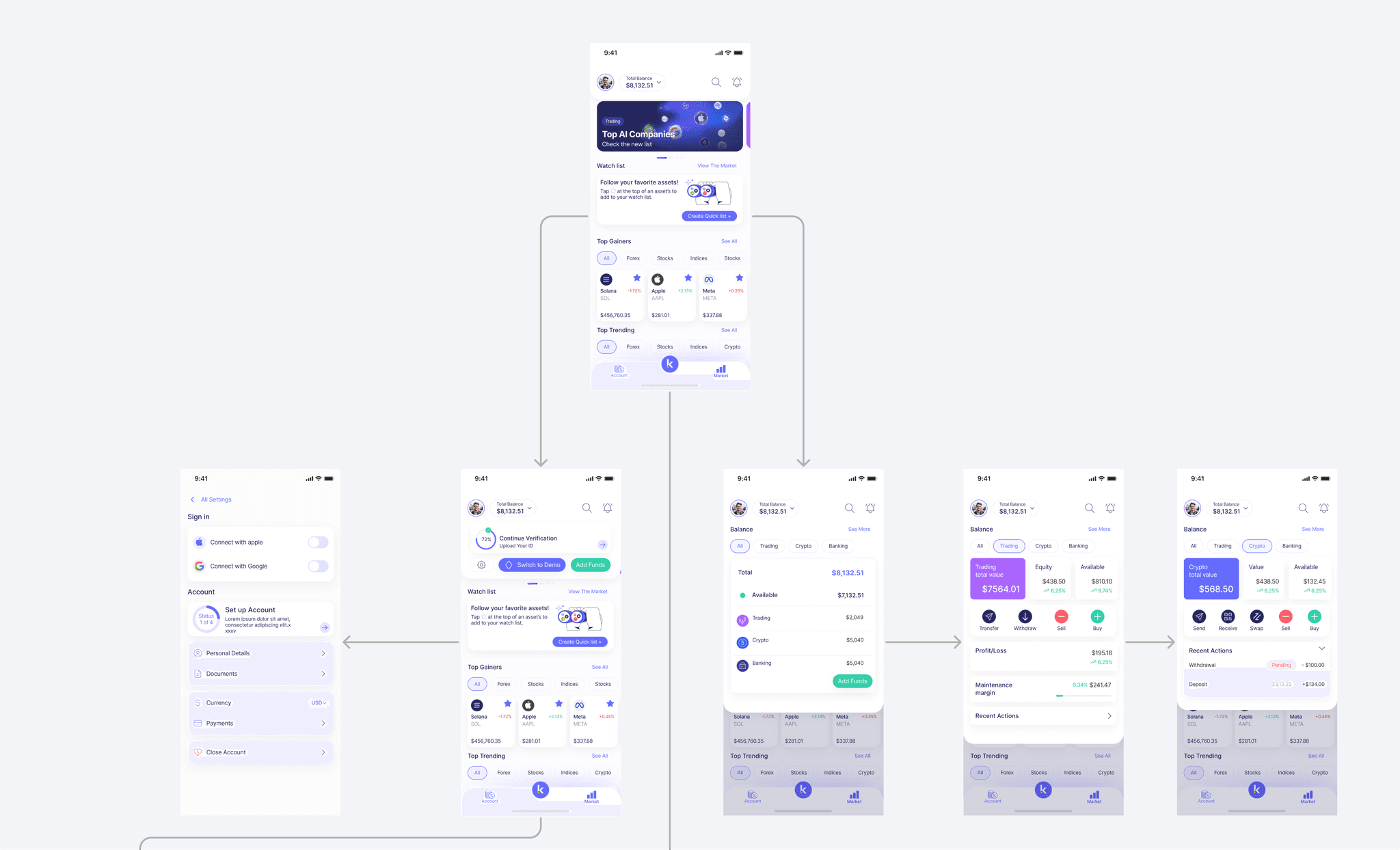
After carefully merging similar functionalities, we established a streamlined hierarchical structure with three primary sections in the app:
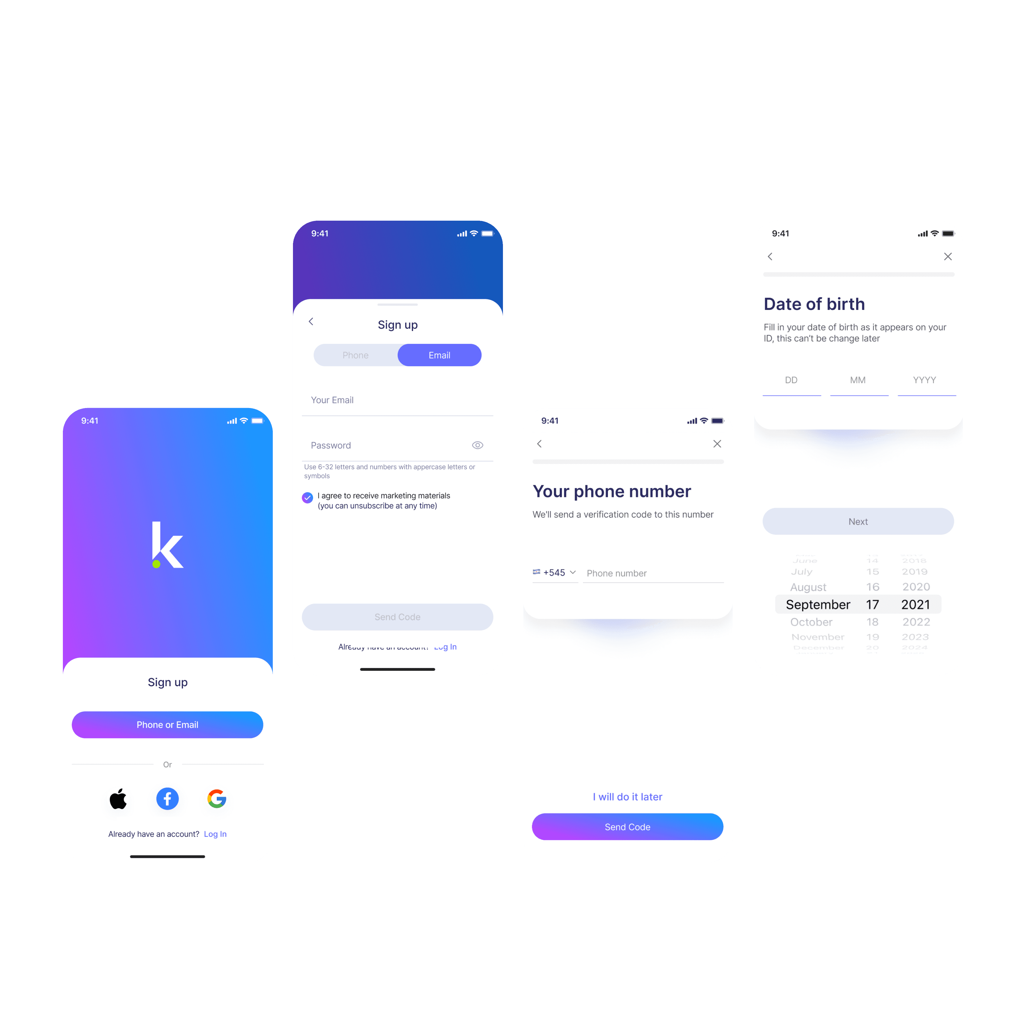
Home Screen
Centralized Dashboard: Provides a summary of the user's overall financial status.
Marketing and Engagement Hub: Features promotional content, educational materials, and tutorials.
Action Encouragement: Presents personalized insights and calls to action to drive user activity.
Market
Unified Asset Marketplace: Consolidates all assets (stocks, cryptocurrencies) into one place.
Interactive Asset Management: Allows users to view and interact with assets seamlessly.
Action Selection: Enables decisions like trading or buying for the wallet within a single interface.
Account
Comprehensive Portfolio: Unifies portfolio management, digital wallet, and total asset balances.
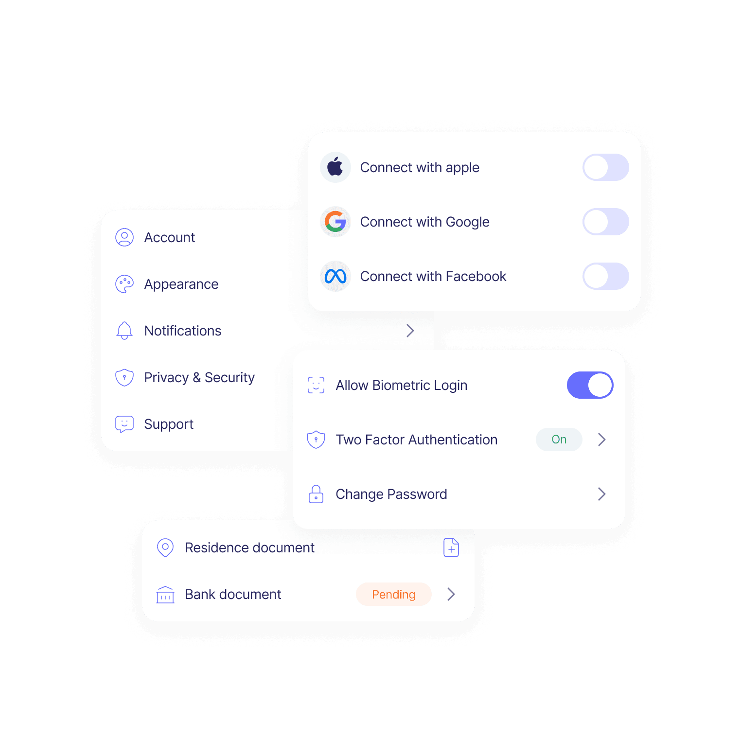
Account Management: Offers access to settings, transaction history, and personal information.
Financial Overview: Provides a complete picture of the user's financial holdings.
Rationale Behind the Structure 🧠
Simplified Navigation
Reduces main navigation to three core sections, minimizing complexity.
Users can easily switch between essential functions without confusion.
True All-in-One Experience
Integrates all services seamlessly, embodying the all-in-one vision.
Eliminates the need to navigate through separate sections for related tasks.
Efficient Information Architecture
Merging similar functionalities enhances discoverability and usability.
Creates a cohesive user journey, aligning with best UX practices.
Initial Proposal and Its Limitations
Original Idea: Assign each product (trading, banking, digital wallet) its tab in the bottom navigation bar.
Why It Wasn't Ideal:
Fragmented Experience: Reinforced separation between products, contradicting the unified vision.
Increased Complexity: Required users to navigate between multiple sections, causing potential confusion.
Redundancy: Similar functionalities would be duplicated across different sections.
Advantages of the Adopted Structure ✅
Seamless User Experience: This feature centralizes access to all functionalities, enhancing efficiency and allowing users to perform actions across products without unnecessary navigation.
Intuitive Design: Simplifies the interface, making it more approachable and presenting information logically to reduce cognitive load.
Business Benefits: The Home Screen serves dual purposes by providing space for marketing, user engagement, and educational content, supporting business objectives while enhancing user empowerment.
Scalability: The flexible structure accommodates future features without redesigning the navigation, supporting adding new services while maintaining consistency.
Designing Navigation & UI Structure
Adopting the Bento Grid Layout: Chosen for its modularity and scalability, the bento grid layout allows users to view all essential balances and functions at a glance through identifiable cards. Each card can expand to reveal detailed functionalities, maintaining a clean and uncluttered interface.
Advantages:
Scalability: Easily integrate additional financial products without overhauling the UI.
Regulatory Compliance: Based on local regulations, display only services available in the user's region, ensuring compliance without disrupting the overall structure.
User Clarity: An organized view of multiple services enhances navigation and user understanding.
Development Efficiency: Modular design simplifies implementation and future updates.
Functional Grouping: Grouped functions into logical categories, such as balance management and transactions, reducing cognitive load and making essential features easily accessible.
Hierarchy & Simplification: Prioritized critical features (e.g., balance checks, transactions) for quick access, while nesting less frequent actions within secondary screens or expandable cards to maintain a streamlined user experience.
Key Design Decisions
Wireframes and Prototyping:
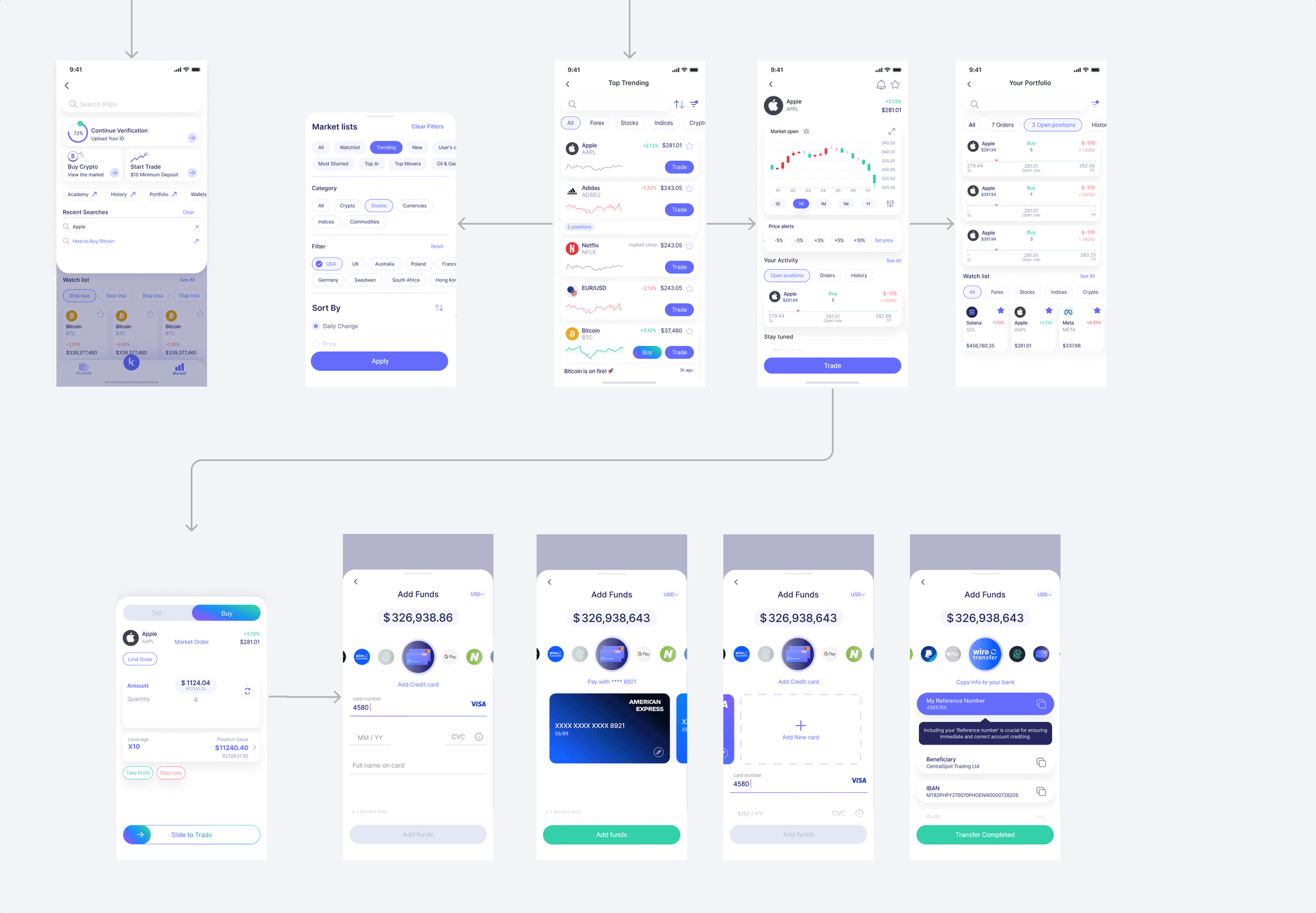
I led brainstorming sessions to generate ideas and developed high-fidelity wireframes and prototypes for selected significant parts of the user journey. By prioritizing critical areas, we ran extensive scenarios and complex flows to determine the most effective way to plan the app's navigation and architecture, ensuring a seamless and intuitive user experience.
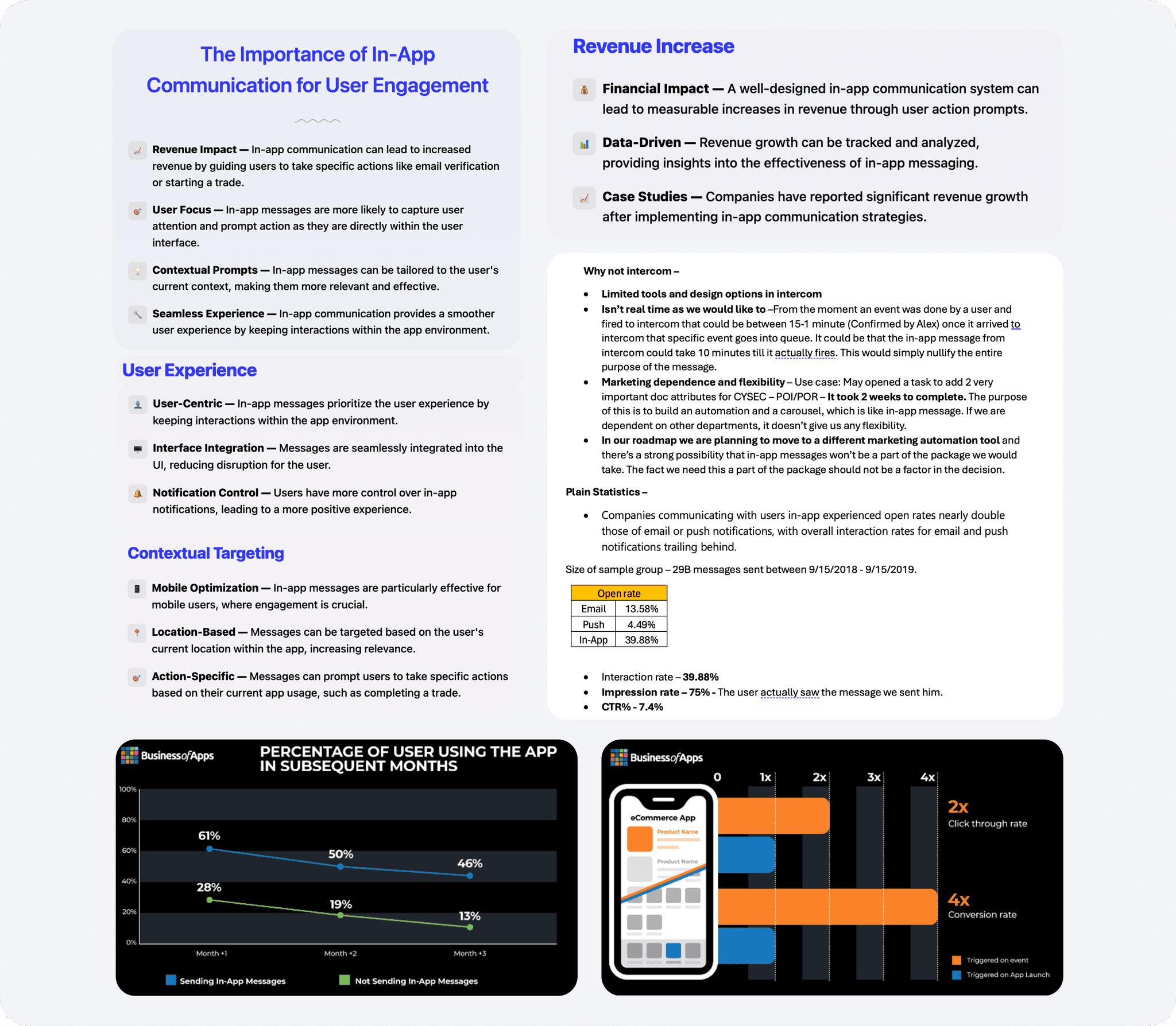
Dynamic Messaging Configuration
Strategic In-App Communications:
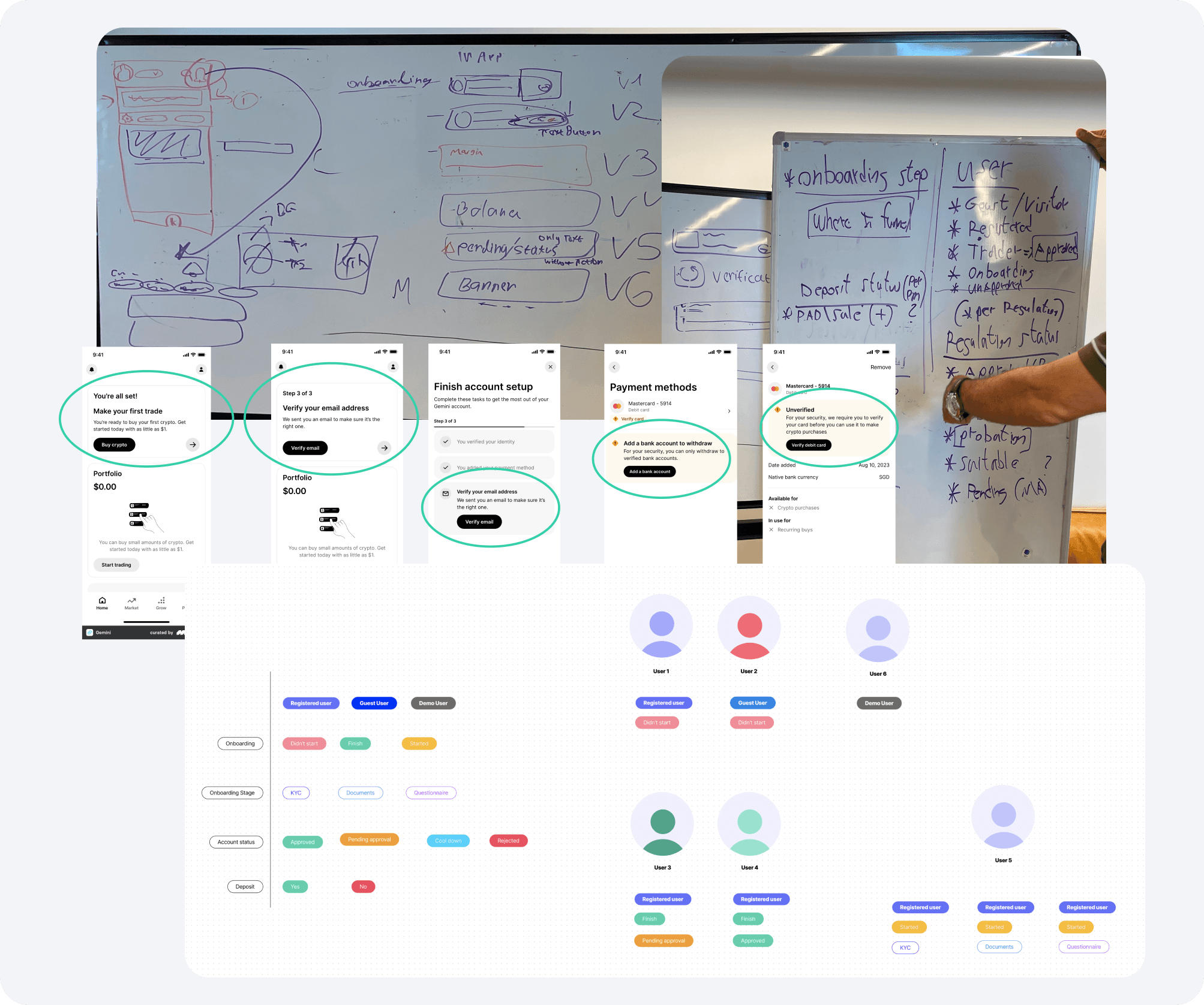
Event Configuration & Mapping: Identified and mapped critical in-app events to create tailored message templates that address all functional and business requirements. This ensures messages are contextually relevant and timely.
Template Development: Designed various in-app message templates to meet diverse needs, including user activation prompts, regulatory compliance reminders, and marketing content delivery. These templates are adaptable to different user actions and app screens.
Integration Across Screens: Implemented in-app messages seamlessly across multiple screens, ensuring consistent user engagement and hidden interactions. This strategic placement drives user actions, supports business objectives, and fulfills regulatory requirements for user verification and profile completion.
Usability Testing and Prioritization
With limited time, I prioritized usability testing on critical action screens like Buy/Sell Asset over generic settings, as these are vital for user satisfaction and business success.
During testing, we introduced sliders for setting purchase amounts and adjusting stop loss/take profit levels, aiming for a clean, gamified interface. However, this design led to user confusion and accessibility issues.
Due to time constraints, we chose to implement a traditional, familiar interface in the MVP to ensure intuitiveness and reliability. We saved the innovative slider concept for future iterations, recognizing that refining it required more time than we had. Our priority was to enhance usability and meet deadlines while keeping innovative ideas for later enhancements.
POC: Accelerating Development with TradingView Integration
Challenge:
With tight deadlines and limited resources, we needed to deliver comprehensive asset pages featuring advanced financial data and interactive charts. Building these components from scratch would have significantly delayed the project.
Solution:
To expedite development without compromising quality, I researched external services and identified TradingView, a leading provider of financial visualization tools that offers embeddable widgets and charts through its Lightweight Charts library and Widget APIs.
POC Initiative:
I led a Proof of Concept (POC) with the development team and VP of Product to evaluate integrating TradingView into our app. The POC focused on:
Technical Integration: Tested compatibility using TradingView's Lightweight Charts and Symbol Overview widgets, which can be embedded via iFrames or integrated with their JavaScript API.
UI/UX Customization: Customized widgets to align with our design system—adjusting styles, colors, and functionalities for a seamless user experience.
Functional Alignment: Ensured the widgets met our requirements for real-time data, interactive charts, and detailed asset information.
Advantages:
Accelerated Development: Leveraging TradingView's components reduced development time and effort.
Enhanced User Experience: Provided users with professional-grade financial charts and data visualization.
Resource Optimization: Allowed the development team to focus on other critical app areas, maximizing productivity.
Outcome:
The POC confirmed that integrating TradingView's widgets was effective. We successfully customized and integrated them, delivering asset pages that met all functional and aesthetic requirements.
Conclusion:
By incorporating TradingView's embeddable widgets, we optimized our development process under time and resource constraints. This strategic integration enabled us to deliver feature-rich, user-friendly asset pages, enhancing our app's quality without compromising timelines.
Design System Development
Throughout the design and development process, I established a comprehensive Design System throughout the design and development process to ensure visual consistency, improve efficiency, and facilitate collaboration. Key components included:
Visual Identity: I crafted a cohesive visual identity by defining consistent branding elements such as logos, color schemes, and typography across the app.
Design Tokens: Implemented design tokens to standardize design elements like colors, fonts, and spacing, ensuring consistency and scalability throughout the interface.
Interaction Patterns: Established consistent interaction patterns and animations to provide an intuitive and seamless user experience.
This comprehensive design system enabled efficient collaboration between design and development teams, reduced redundancy, and ensured a consistent, high-quality user interface throughout the app.
