Mapping Advanced Settings in a Financial App
This project played a key role in evolving our financial trading app to support its vision of becoming an all-in-one platform. As the senior product designer, I spearheaded the redesign of the settings section to enhance functionality, organization, and user control, ensuring seamless management across the app.
Role:
Senior product designer, UX Researcher
Product:
Trading, Wallet & Banking App
Industry
Finance
Streamlining for Simplicity and Control ⚙️
Our goal was to streamline the settings with a clear hierarchy and scalable architecture, empowering users to manage their profiles, payment methods, documents, and more in a seamless, intuitive space. With improved categorization, real-time feedback, and enhanced control, we transformed the settings into a user-friendly hub that supports the app’s comprehensive functionality.
What’s the problem? 💔
The original settings section lacked a clear hierarchy and logical structure, leading to cluttered navigation. Users struggled to manage their profiles, payment methods, and documents without real-time feedback or status updates. Additionally, the limited control over customization caused frustration, as key options were buried in a disorganized layout. This resulted in confusion and inefficiency, with users unable to manage their accounts effectively.
Cluttered Layout and Poor Hierarchy: The settings section was disorganized and lacked logical grouping, making it difficult for users to navigate. Key functionalities like profile management, payment updates, and notification preferences were hard to find, leading to a frustrating experience.
Inconsistent Navigation and Limited Control: Users struggled to locate and revisit essential options, such as editing personal details, managing security settings, or updating communication preferences. The lack of flexible control over these crucial functions restricted users from fully customizing their experience.
Lack of Feedback and Status Updates: The app failed to provide real-time updates for crucial actions like document verification, account status changes, or pending requests, such as withdrawals. This left users uncertain about the progress of their tasks and contributed to confusion.
Scalability Issues: The lack of a structured settings architecture made supporting future app growth and added functionalities difficult, leading to a cluttered, hard-to-navigate interface.
UI Gaps: Some functionalities, like language-switching, are available within the app but lack proper UI design. As a result, the app defaults to the system’s native design, which creates an inconsistent experience and reduces the overall user interface quality.
Irrelevant and Non-Editable Input Fields: Input fields unrelated to the user's current stage (e.g., onboarding fields like phone code or country) are displayed but cannot be edited. Some fields incorrectly show mandatory status indicators despite being non-editable.
Non-Accessible Toggles: Instead of using a clickable toggle for options, the design relies on small, non-clickable checkboxes, making interaction difficult and reducing accessibility.
Missing Status for Email/Phone Verification: The settings do not clearly indicate whether the email or phone number has been verified, and there is no option to re-verify or update this information.
Poor Payment Method Accessibility: Users cannot manage payment methods directly from the settings, as this option is buried within another section of the app, making navigation inconvenient.
Customer Support Insights:
To refine the settings design, I consulted with our customer support team, which frequently handled user complaints. One of the major issues they reported involved the Marketing Automation System (Intercom), which was primarily used to send push notifications for key onboarding actions—such as document uploads, email verification, phone number verification, identity checks, and credit card verification.
However, due to the lack of in-app events and missing options to perform these actions directly through the settings, the system would only direct users to a generic page instead of taking them to a dedicated section for completing these actions. As a result, users struggled to find where to complete tasks like verification and frequently had to contact support for assistance. Additionally, there was no status tracking for the overall profile verification process (such as profile completion and moving to “approved” status), leaving users unsure of their progress and adding friction to the experience.
This feedback highlighted the critical need for:
Dedicated in-app settings for verification tasks (e.g., email, phone, and document verification).
Real-time status updates for profile completion within the settings.
Direct navigation to specific settings areas for resolving onboarding-related issues.
Research The Best Practices:🕵🏻
I conducted research on settings hierarchies across a range of popular apps, including Instagram, TikTok, Moovit, Walt, and financial apps like Revolut, Gemini, and Wise, as well as operating systems like iOS and Android. This research provided key insights into building an intuitive settings structure:
Insights & Actions:
Leverage Familiar UX Patterns: Users prefer familiar navigation patterns. Drawing inspiration from widely used apps like Revolut and iOS, I ensured that users could intuitively manage tasks such as updating profiles, payment methods, and notifications without needing to relearn the interface.
Implement Clear Categorization: I organized settings into logical categories, such as Profile, Security, Privacy, and Notifications, making it easier for users to find relevant options and streamline their interactions quickly.
Use Progressive Disclosure: I adopted progressive disclosure to avoid overwhelming users. I showed only essential options upfront and revealed advanced settings when necessary. This approach kept the interface clean and reduced cognitive overload.
Maintain Consistent Navigation: I ensured consistent navigation throughout the settings, allowing users to seamlessly switch between sections and return to previous screens without confusion.
Inner Flows Research: I mapped out the inner flows for every core functionality within the settings, such as account management, security preferences, and notification settings. Each flow was carefully designed to reduce friction and ensure smooth navigation between steps. This process also included researching how similar apps streamline their inner flows to enhance user efficiency and satisfaction.
Design Process:
Comprehensive Requirements Mapping:
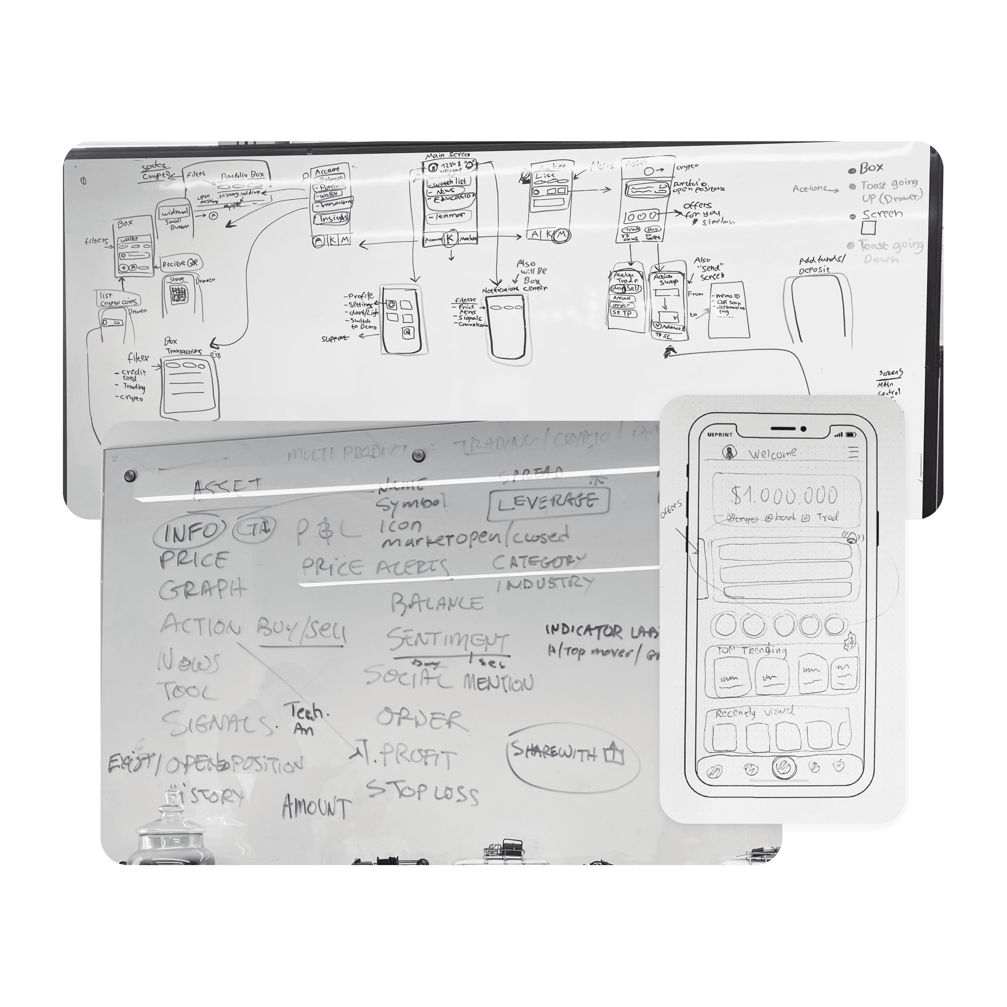
The process began with a detailed mapping of all the necessary settings options. This included identifying the full range of features users need to manage their profiles, payments, security, and other areas. Extensive discussions with the product manager helped prioritize these features based on user needs and business goals.
Define Default Modes: A vital part of the design process involved defining default settings. By equipping users with optimal default settings, such as security preferences (e.g., two-factor authentication), I aimed to make onboarding smoother and help users focus on their goals. Apps like 1Password and LastPass, which prioritize security settings by default, inspired this approach.
Grouping and Hierarchy:
After mapping the features, I focused on organizing them into logical categories. This process included breaking them into groups like Profile, Security, and Notifications, then defining each category's hierarchy. Creating this hierarchy was crucial for intuitive navigation and smooth user interaction.
Flow Design:
Once the settings architecture was in place, I developed the entire flow for navigating through the settings, outlining how users would move between different sections, what actions they could take, and what screens they would see at each step. I ensured the flow aligned with fundamental UX principles to ensure seamless interaction.
Feature Prioritization:
With numerous potential features in mind, I worked closely with the product manager to prioritize essential functionalities for the initial release. While we considered adding advanced flows, such as a detailed flow for closing an account or viewing uploaded documents in detail (not just status updates), we decided to focus on the most critical features for users. This allowed us to deliver a minimum viable product (MVP) while keeping other enhancements for future updates. This approach ensured the app met user needs without overcomplicating the initial version.
New Functionalities:
I introduced and designed new functionalities, such as two-factor authentication (2FA), profile picture uploads, and username selection. These features were critical for improving security and personalization, which were previously lacking in the app.
High-Fidelity Wireframes:
After structuring the flow, I developed high-fidelity wireframes for each screen. These wireframes provided detailed, pixel-perfect designs that mapped out all user interactions and visual elements, ensuring a smooth transition from concept to development.
Dynamic Screen Mapping:
I mapped out different user types and scenarios for screens that involved dynamic functionalities (such as those tied to onboarding). This included identifying how various users would interact with the settings based on their onboarding status and permissions, ensuring we covered all potential use cases. For example, some users might have restricted access to specific features based on their onboarding progress, which must be reflected in the design.
Prototyping and User Testing:
I created interactive prototypes to simulate user interactions and tested usability with real users to identify potential pain points or confusion. The feedback from these sessions was invaluable in refining the final design.
Iterative Refinement:
I made necessary adjustments to the wireframes and flows based on testing results, ensuring a user-centered, data-driven design approach. Each iteration was carefully aligned with both user needs and the product vision.
Cross-Functional Collaboration:
I collaborated closely with developers throughout the design process to ensure feasibility and alignment with the technical infrastructure. Regular feedback loops helped maintain the balance between design and functionality.


