This project marked the first milestone in developing and redesigning our entire application.
As the senior product designer, I led the process alongside a talented product manager, overseeing UX/UI research, creativity, solution creation, and implementation with the development team.
Role:
Senior product designer, UX Researcher
Product:
Trading, Wallet & Banking App
Industry
Finance
50 First Onboards:
Redesigning the Perfect
First Impression ✨
Just like in '50 First Dates,' our onboarding needs to make a lasting impression from the start.
This case study covers redesigning our financial app's onboarding for trading, crypto, and banking.
We simplified the process with a one-question-per-screen approach, added gamification, trust elements, educational info, personalization and prioritized empathy to meet regulatory demands and improve user experience.
We knew we had to charm our users from the very first screen...

What’s the problem? 💔
Our original onboarding was like a first date with too many awkward silences and complicated questions, leaving users overwhelmed and disengaged.
The primary problem was an onboarding experience overwhelmed by stringent regulatory demands across different financial domains, leading to high user drop-off rates. Industry data shows financial apps often face a 40-60% drop in user retention during onboarding due to their complexity and time requirements. Our app also experienced significant user drop-offs, especially during the documents step.
This necessitated a redesign to make the onboarding process compliant, more accessible, and less intimidating to new users.
User Research:
Smart Stocking for
the Perfect First Date 🕵🏻
Before a first date, a little smart stocking can make all the difference.
I didn’t just browse their Instagram; I analyzed user data and behaviors using various methods.
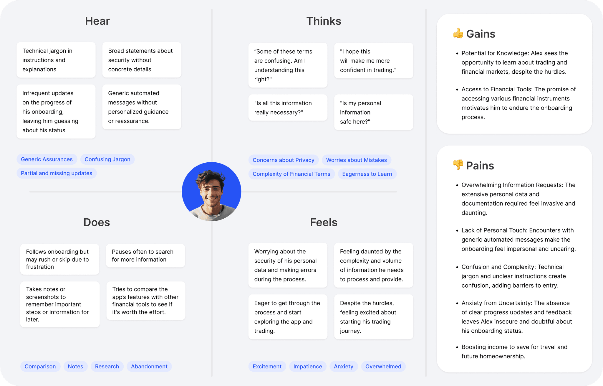
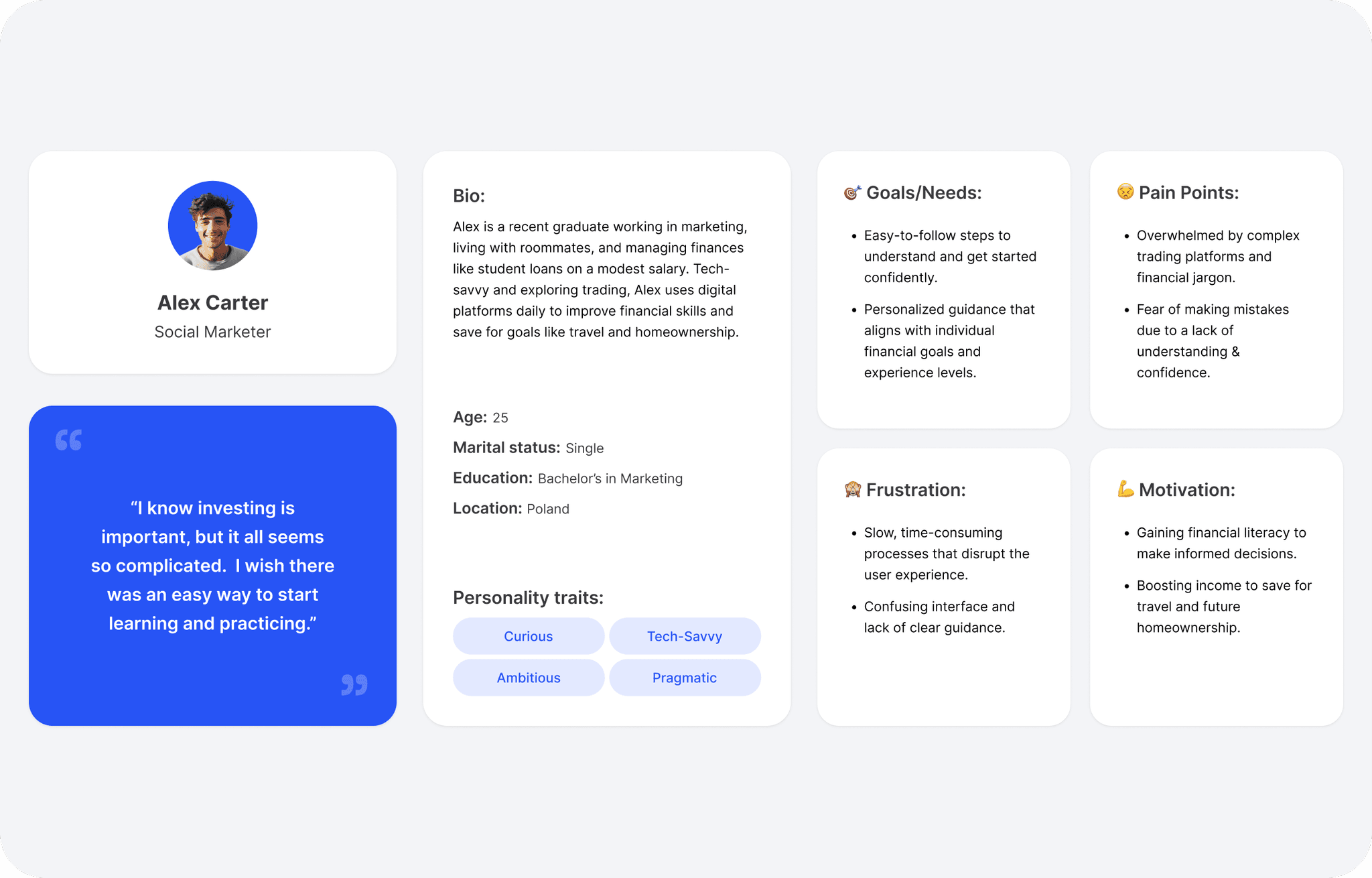
I led the creation of personas, empathy maps, and user journeys to ensure our onboarding redesign was perfectly tailored to our users' needs.
Analyzed Data from the Existing Application
By examining user data and analytics from the current application, we identified pain points and stages where users dropped off during the onboarding process. This analysis provided valuable insights into user behavior and highlighted critical areas in need of improvement.
The onboarding data revealed significant drop-offs at various stages. Despite having 727 registered users, only 368 (50.62%) completed the personal information step, resulting in a loss of 359 users. As the process continued, only 102 users (14.03%) successfully passed the KYC and questionnaire stage, demonstrating how the lengthy and unclear process significantly impacted user retention. The document upload step was particularly challenging, with only 56 users (7.70%) managing to upload the required documents, further emphasizing the need for a more streamlined and user-friendly process.
Key Issues Identified:
High Drop-Off at Registration: 50.62% of users failed to proceed past the personal information stage.
Lengthy and Confusing KYC Process: Only 14.03% of users completed the KYC and questionnaire steps.
Complex Document Upload: Only 7.70% of users successfully uploaded the necessary documents, indicating unclear instructions and technical challenges.
Competitor Analysis: KYC & Onboarding Processes
We carried out a comprehensive analysis of our competitors' onboarding processes to gain insights into industry standards and best practices. This in-depth research enabled us to identify features and approaches that could be integrated into our redesign or strategically avoided.
Built User Personas & Created Empathy Maps
Developed detailed user personas to represent different segments of our target audience. These personas helped tailor the onboarding experience to meet the specific needs and behaviors of our users.
Created empathy maps to understand users' feelings, thoughts, and motivations during the onboarding process. This tool helped us keep the user’s perspective at the forefront of our design decisions.
Mapped the User Journey
Mapped out the entire user journey from app download to onboarding completion. This visualization identified key touchpoints and potential friction points, guiding our redesign efforts.
Problem Identification: Insights from the User Experience Lab So Far 🧪
Our onboarding process had multiple user experience (UX) flaws, along with technical limitations and restrictions on flexibility and customization. Beyond the visual redesign, we restructured the information architecture to improve the onboarding flow, the steps visible to the user, how they are presented, and the user's ability to revisit them.
Sign-Up Options:
🚫 Problems:
Lack of Quick Sign-Up Options:
The previous onboarding lacked quick sign-up options (Google, Facebook, Apple), forcing users to input usernames and passwords manually. This extra step increased friction, causing potential drop-offs and diminishing the overall user experience, especially for users seeking efficiency.No Guest Access:
Requiring users to complete all onboarding before exploring the app can deter potential users. Many users prefer to "test drive" an app before committing. This forced registration can feel restrictive and overwhelming, leading to premature abandonment.
✅ Solutions :
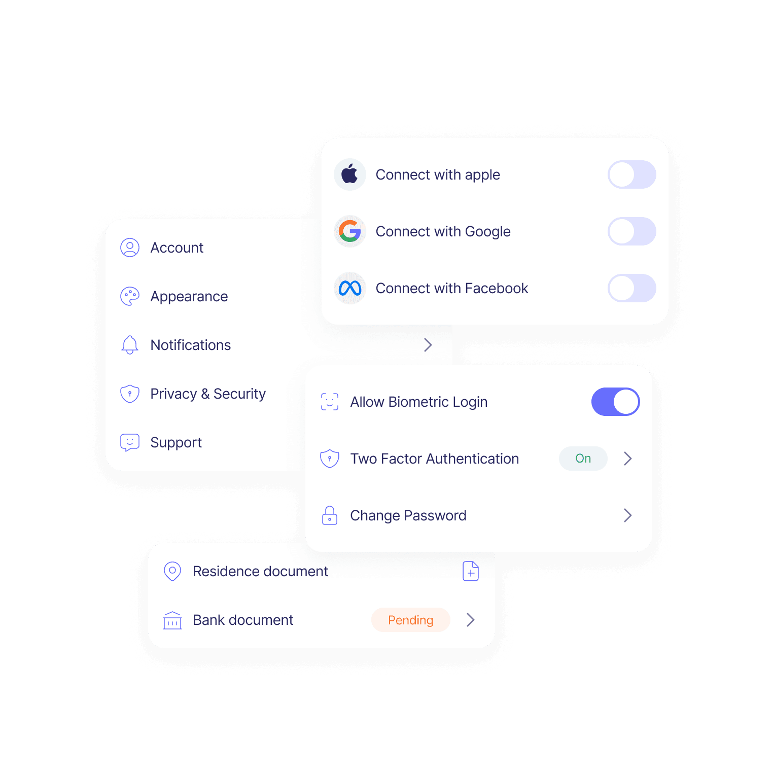
Integrated quick sign-up options: Users can now sign up through Google, Facebook, Apple, or their phone number. This reduces the steps required and automatically populates essential information, improving trust by leveraging familiar, secure platforms.
Streamlined welcome process: We removed the need for users to manually click through each welcome screen, making the onboarding smoother and less intrusive.
Enhanced security: Biometric authentication options like fingerprint and facial recognition were added, further building user confidence in the app’s security.
Guest Access: We introduced a guest access feature that allows users to explore the app before onboarding, increases user engagement, and reduces drop-offs.
🧐 Testing Phase Before Implementation:
Tested live on the existing app: We made minor changes with minimal development resources.
We prioritized impactful features. We tested only significant changes, such as guest access, to ensure these improvements would directly enhance user experience.
Validated improvements: Successful tests directly improved the app’s performance, confirming their effectiveness before full rollout.
However, full disclosure: In the current app, we cannot track in-app events at a detailed user level, limiting our ability to gather comprehensive behavioral analytics. We have only general registration statistics, which show a slight increase. Additionally, the current app has UX and technical issues, such as bugs, delays, and problems with verification codes and document uploads—critical aspects that will be addressed in the new app.
UI Overload:
🚫 Problems:
Cluttered Design: The previous UI was cluttered, overwhelming users and distracting from the onboarding process.
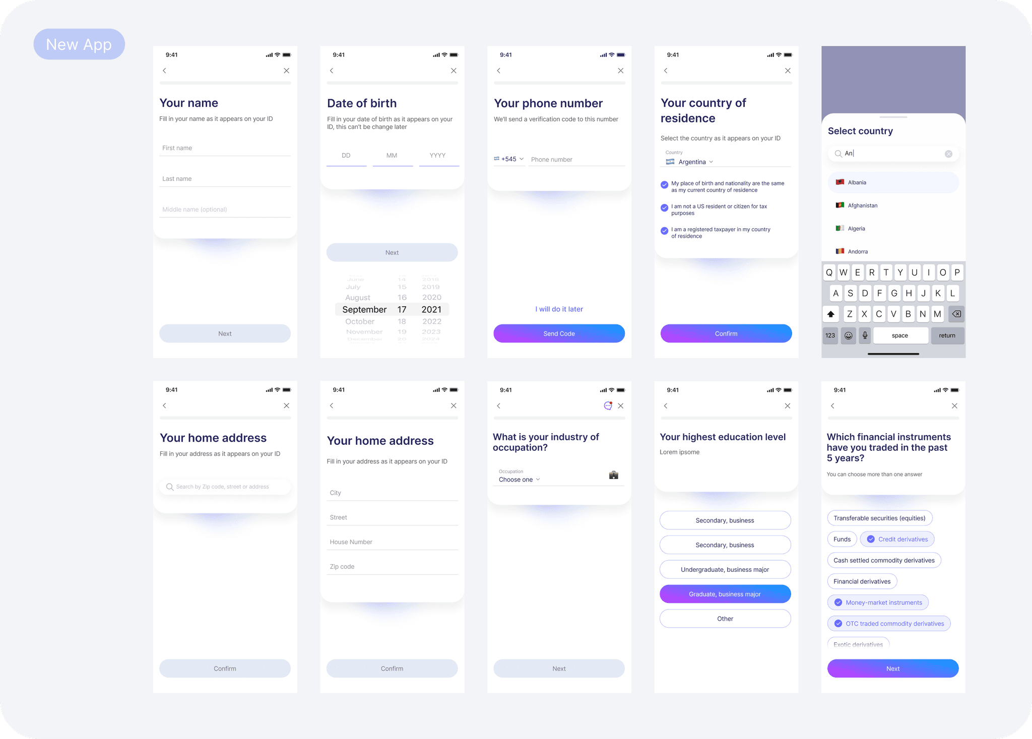
Lack of Focus: The design presented too much information at once, particularly during the questionnaire stage, where users had to scroll through long lists of questions on a single screen. This made it difficult for users to concentrate on individual questions and increased cognitive load, leading to frustration and drop-offs.
✅ Solutions :
Minimalist Redesign: As part of our rebranding effort, we adopted a clean, minimalist design, which significantly improved readability and reduced visual clutter.
One Question Per Screen: We restructured the onboarding process, including the questionnaire and fields for personal details, to display one task per screen. This approach reduces cognitive load and makes the process less overwhelming, encouraging higher completion rates.
Streamlined Development: The simplified UI improved user experience and made the development process more efficient, ensuring a consistent and cohesive design across all onboarding screens.
Communication & Data Transparency:
🚫 Problems:
Lack of Communication & Feedback: The onboarding process didn't provide clear communication or feedback, leaving users uncertain about their progress.
Data Collection Transparency: Users were hesitant to share personal information because it wasn’t clear why certain data was needed.
✅ Solutions:
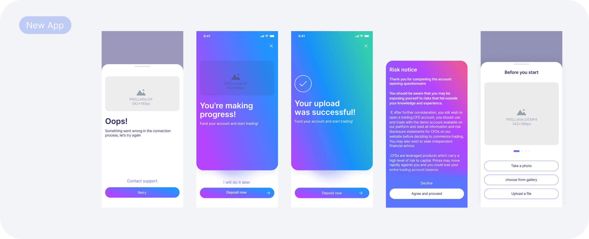
Clear Feedback & Guidance: We improved the UI and UX by adding progress indicators, positive feedback loops, and helpful prompts. We also introduced breaks between each step of the onboarding process, with screens offering congratulatory messages for progress and specific feedback. These screens separate each step and indicate what to expect in the next stage, making the process smoother and more engaging.
Data Collection Transparency: We clearly explained why specific data is required through the design, addressing concerns, building trust, and reducing drop-offs.
These solutions provide dedicated areas within the interface for UX writing. We'll implement this in later stages to further enhance communication and ensure people understand each step of the process.
Linear Flow vs. Modular Flow:
🚫 Problems:
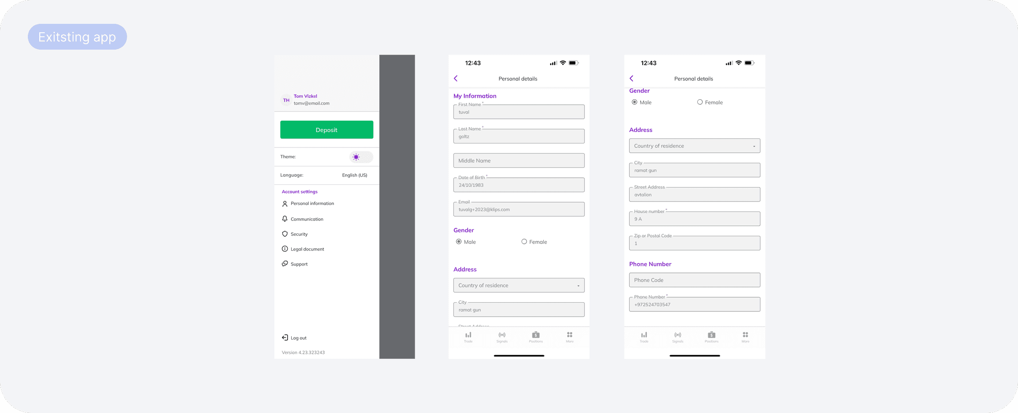
Rigid, Linear Process: The old onboarding process forced users to complete all steps in one go, which was overwhelming and caused drop-offs.
No In-App Flexibility: Users couldn't complete specific onboarding tasks, like adding an email or updating their address, from within the app. The old system only allowed users to view details they had already filled in without the ability to edit or add new information through that section. This lack of accessible entry points forced users to rely solely on the linear onboarding process.
✅ Solutions :
Modular Flow Enabled Rewards: We restructured the information architecture to improve how steps are presented and revisited. Users can complete tasks in smaller steps by dividing the onboarding process into sections. For example, if a user pauses at the personal details stage, they can later be prompted to move directly to the document upload step. This method reduces cognitive load, allows users to explore the app at their own pace, and increases completion rates.
Familiar Approach: Similar to LinkedIn or Facebook, users are prompted to gradually fill in their profile by completing tasks such as uploading a photo or adding documents. This segmented approach aligns with our "baby steps" concept, where users engage with the app in manageable portions rather than all at once. Financial apps like Revolut and Binance also use this strategy, guiding users to finish tasks step-by-step.
Progressive Onboarding: This aligns with the principles of progressive onboarding, where tasks are introduced gradually to reduce user overwhelm and drop-offs (Onboarding Academy)
Behind-the-Scenes Work: The technical restructuring allowed each onboarding step to be independently developed, making the process more flexible and user-friendly.
Detailed Case Study: For more information on how these changes were implemented and connected to in-app communication, you can check out the case study in my portfolio.
Document Verification Process:
🚫 Problems:
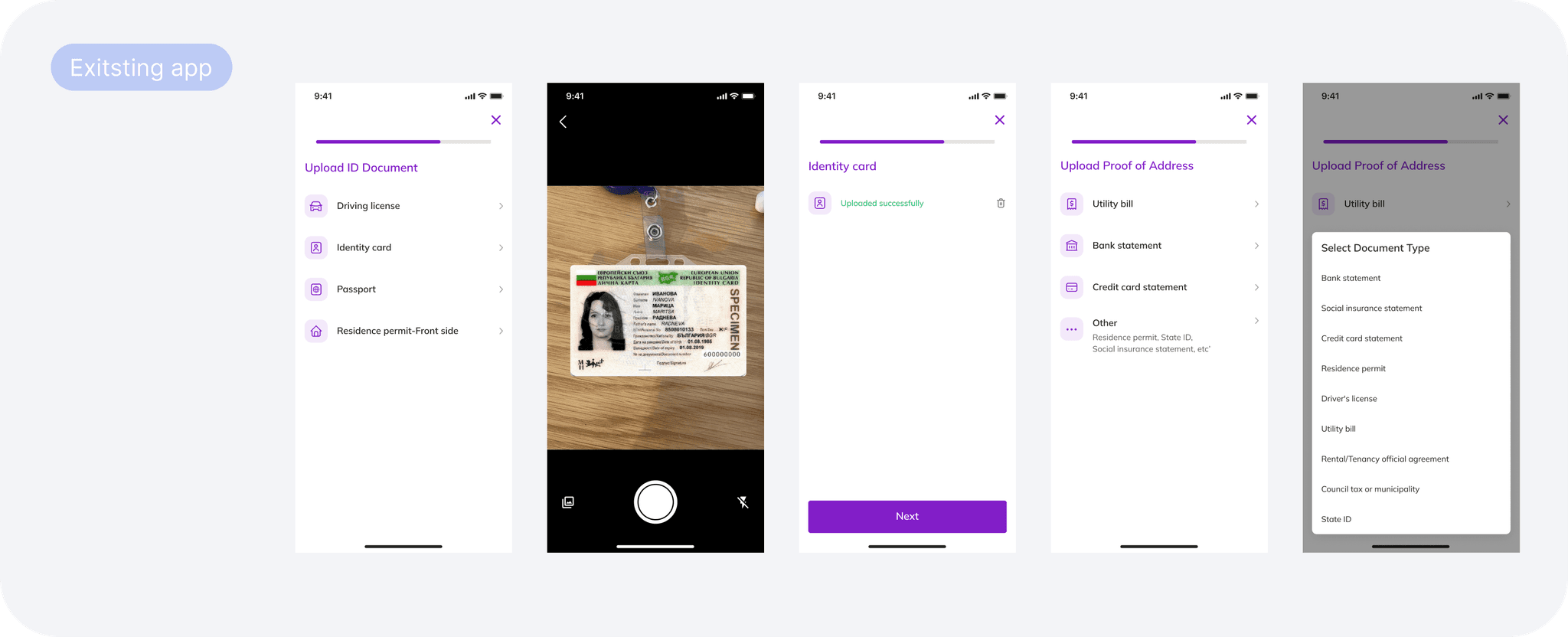
Incorrect Document Uploads: Many users uploaded incorrect documents due to unclear instructions. Key details like document clarity, matching the provided address, or validity within six months were not effectively communicated, leading to many rejections.
File Upload Issues: Users faced technical difficulties when uploading documents, leading to delays and frustration.
Inability to Upload Multiple Images: Users couldn't upload more than one image during the document upload process. This was particularly problematic when users were required to upload both sides of a document, such as an ID card.
Confusing File Selection UI: The interface made it seem like all document types needed to be uploaded. The unclear buttons and multiple options overwhelmed users, making it hard to understand that only one document was required.
✅ Solutions :
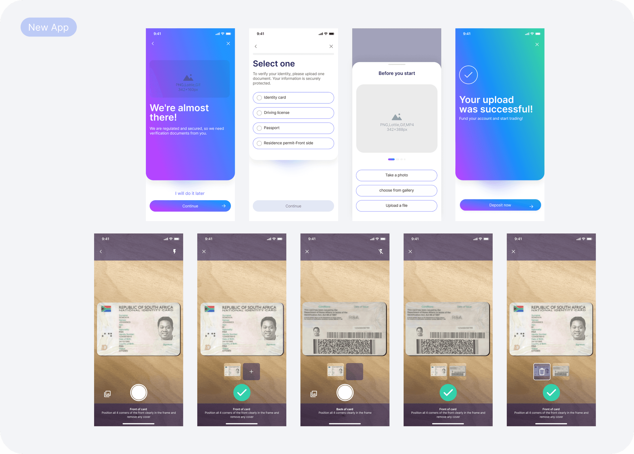
Provide Clear Instructions & Example Screens: We added an instruction screen with guidelines for each document type (e.g., clarity, matching address, and validity). We included example images to help users clearly understand what’s required.
Fix the File Upload Experience: We resolved the technical issues with the upload process, creating a smoother and more reliable experience.
Implement Multiple Image Upload: We introduced a feature that allows users to upload multiple images in sequence, enabling them to submit both sides of the required documents without any issues. This improvement made the verification process faster and more efficient.
Redesign the File Selection UI: We revamped the file selection screen to clearly show that only one document type needs to be uploaded. This update made the options more distinct and intuitive, reducing confusion.
Enhance Communication During Upload: We upgraded the camera interface for document uploads, adding real-time, on-screen instructions to guide users and ensure proper document compliance during the photo capture.
Integrate Trulioo for Document Verification: We integrated Trulioo for secure, automated document checks, speeding up the process and minimizing manual errors. This improved both the security and overall user experience.
Enable Quick Scanning with Trulioo: Trulioo’s quick scanning feature allows users to scan cards without manual uploads, similar to identity verification processes in scooter apps. This addition streamlined the process, making the user journey smoother and faster.
Design Phase: From Design Detail to Developer Handoff ✨
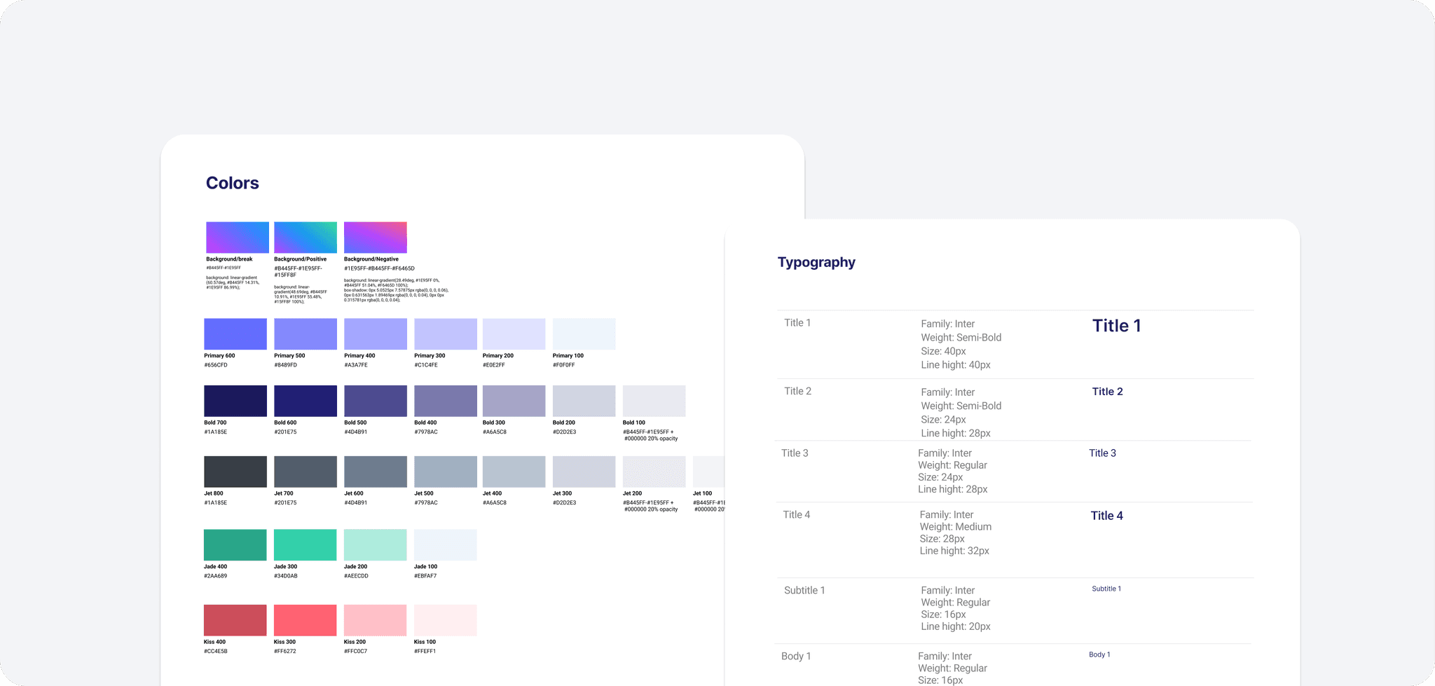
The entire design process is part of a larger design system built for the new app. What you see here is just a glimpse of the new elements we’ve integrated. From updated components to refined layouts, each part was designed to align with the broader system, ensuring consistency and scalability across the platform.
Color Palette & Style
As part of a brand refresh, I updated the primary colors to align with the new visual identity. The refreshed palette created a cohesive and engaging user experience that matched the app’s goals.
Grid System
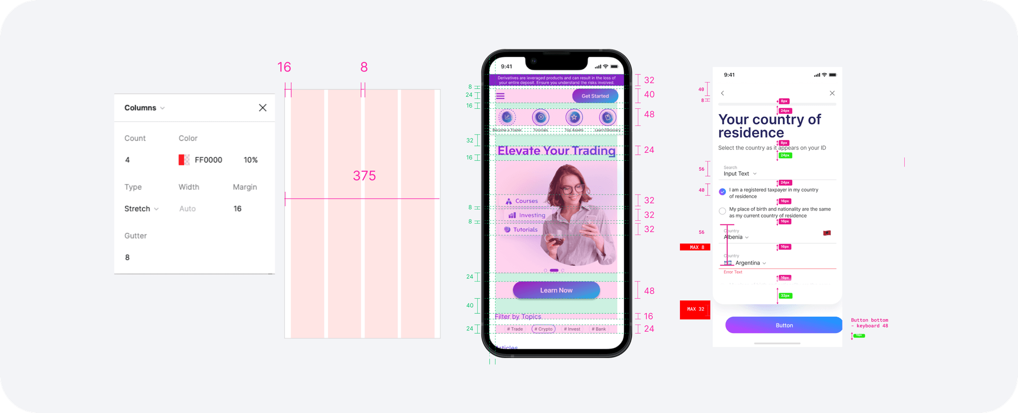
I applied an 8/4 pixel grid system to ensure consistent spacing and alignment throughout the design. I streamlined adjustments to maintain a clean and responsive layout across devices using Figma's advanced auto layout. I also used Figma variables for text styles, colors, and components, ensuring design consistency and making collaboration and handoff to developers smooth and efficient.
Onboarding Flow & Handoff Process
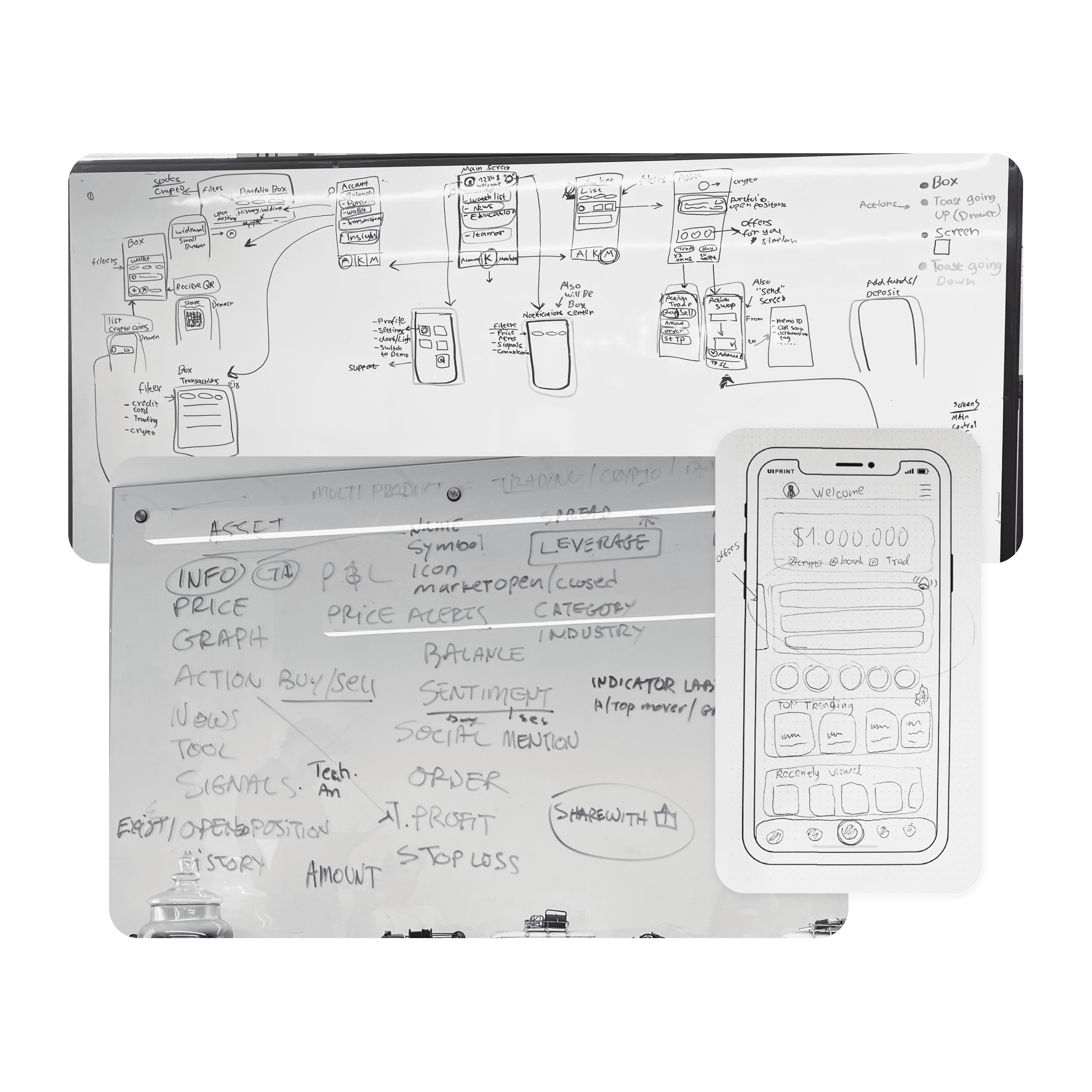
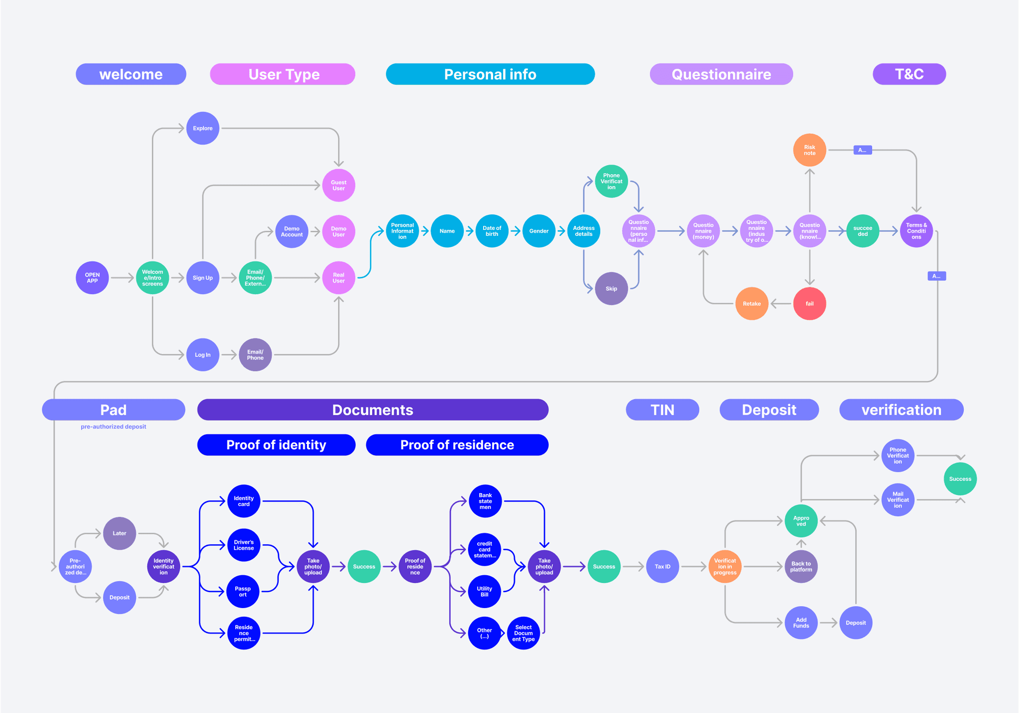
I mapped out the onboarding journey with a basic flowchart and followed it with a detailed wireflow, covering all UI designs, error scenarios, and animations. This flow complemented the prototype, providing a clear visual map. It helped refine the PRD in collaboration with the product manager, ensuring accuracy for the handoff to developers.
Animations & Transitions
We created smooth, natural animations that made transitions between screens seamless and calming. We focused on positive progression and fluid movement to help users feel at ease and reduce any potential anxiety.
All the animations and transitions were integrated into a single screen UI, where users interact with the onboarding flow by answering questions and providing inputs. This approach simplifies the user experience by reducing cognitive load, as users don’t need to navigate through multiple screens. Keeping everything on one screen ensures continuity, minimizes distractions, and keeps the focus on the task at hand—streamlining the experience and reducing friction during the onboarding process.

